It’s time to embrace Pantone’s color of the year!
Steeped in antiquity, the colour purple has historically been associated with royalty, power and wealth as well as spirituality and nobility.
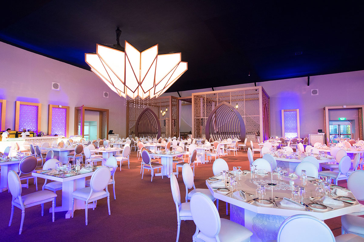
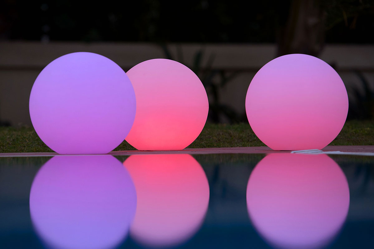
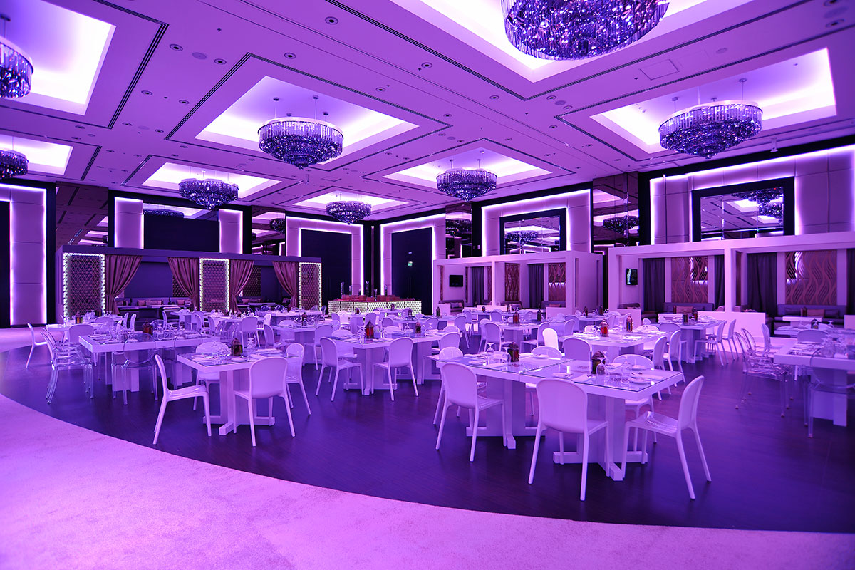
Described by Leatrice Eiseman, executive director of the Pantone® Colour Institute®, as “the most complex of all colours,” PANTONE 18-3838 Ultra Violet was chosen as Pantone’s Colour of the Year 2018, allowing purple to find its place on the throne once more.
Eiseman said, “We wanted to pick something that brings hope and an uplifting message.” Purple-toned lighting is often used in meditation spaces and communities to energize those that gather there.
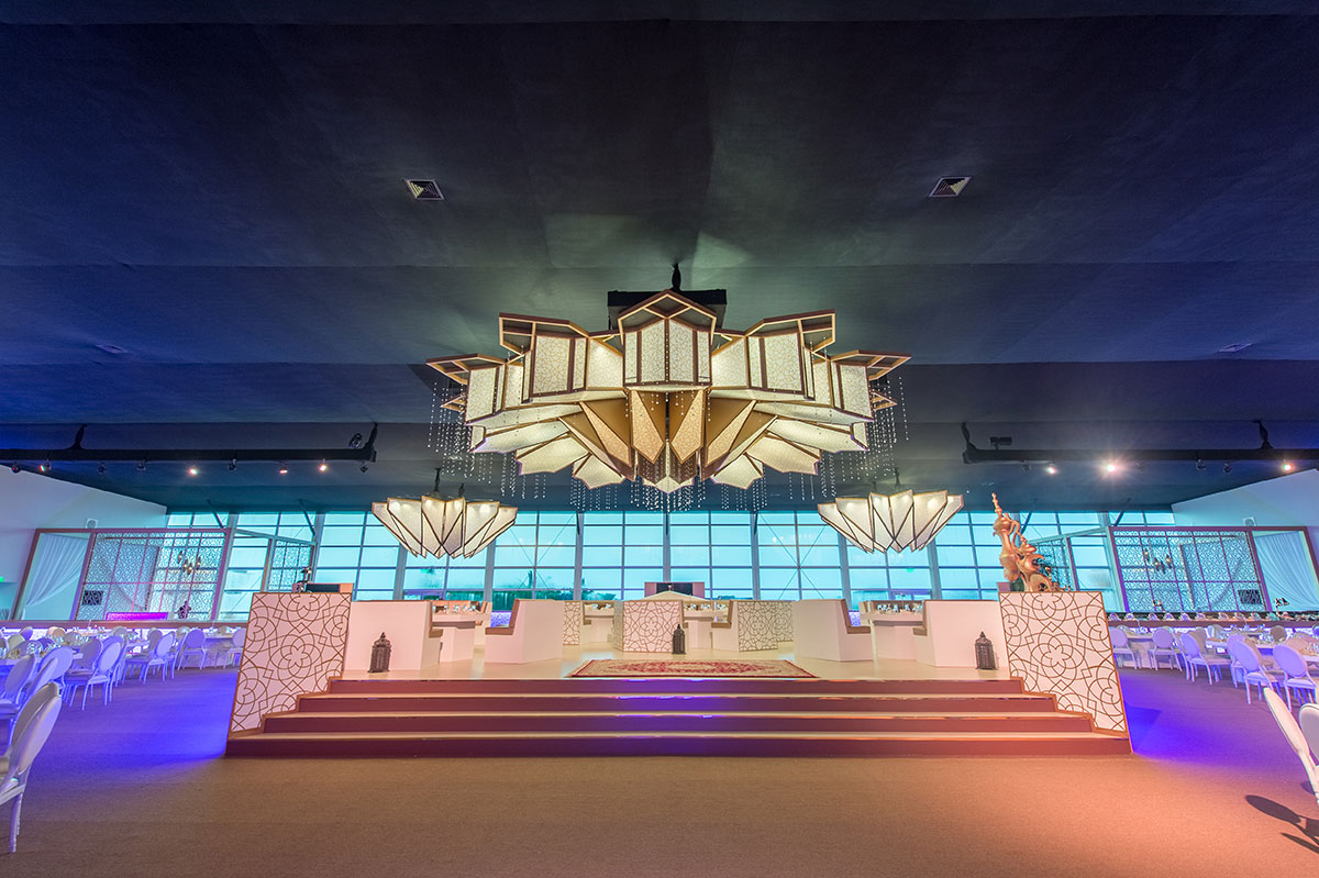
Why should you embrace colour in 2018?…
We use colour as personal expressions of individuality by what we wear and how we look every day, so why stop there. Incorporating such a cheerful, bold colour into your event and exhibition shouldn’t be as frightening as it may seem.
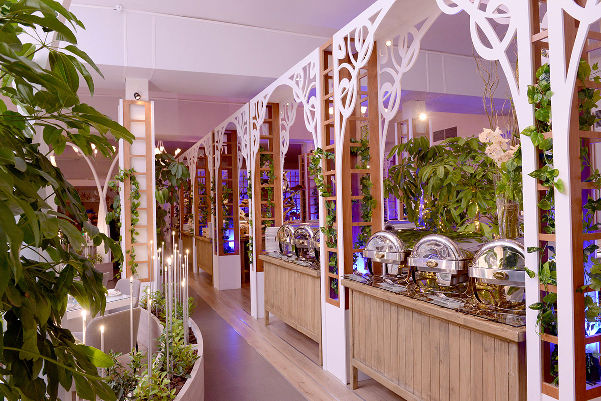
… and here’s how to do it!
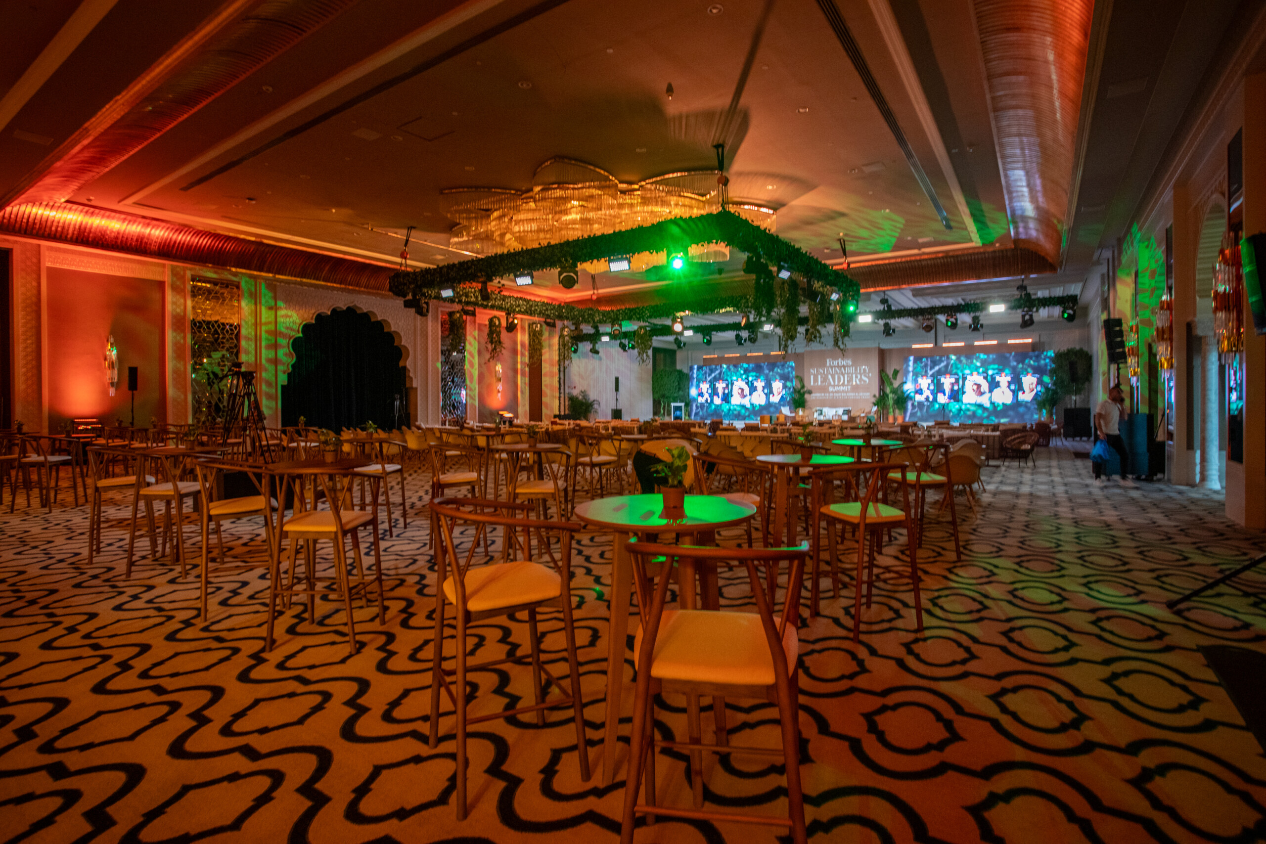
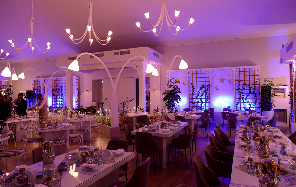
Consider illuminated lighting that transforms from simple pure white forms to colourful bursts of light at night, add a splash of colour with a statement chair or even an elegant lamp that won’t go unnoticed.
If your preferences swing in the way of classic and simple furniture, you can still add this fun, playful element to the setting by adding colourful custom made cushions, add tinted lighting or even a rich vibrant flower arrangement.


Download our Catalogues to find the right solutions for your next project
KSA Furniture
Furniture Catalogue
Tent Catalogue
Enter your name, email and phone number below:
Enter your name, email and phone number below:
Enter your name, email and phone number below:

